5 Common Mistakes You’re Making on Your Website and How to Fix (plus PRO Tips)
We all know the spell of first impression, right?
You only have about 6-10 seconds to make potential visitors bewitched with your website. (Yes, people now have the attention span of goldfish). There are so many things you need to know when building a website. It not only has to be visually appealing, but also has to answer 3 things right away: what you do, who you serve, and how you can help the viewers. Otherwise, they’re going to say namaste to your site.
So, how do you get them to stay put longer?
I’ve put together this list of common website mistakes and how to fix it, so that you can take action and dramatically boost the amount of traffic, leads, sales; and so on. It starts with understanding each of hidden mistakes hurting your website. Let’s get started!
Your Website’s Visitors Can’t Tell What You Do
The first priority is to make your website crystal clear about what you do. Visitors should realize very from that what you are offering and what they are looking for are on the same page, and within seconds!
How to Fix:
Your Website is Not Mobile-Friendly
How are you reading this post right now? There’s a 40% chance that you are on a phone or tablet. According to Statcounter about mobile traffic vs desktop traffic in 2020, most internet traffic comes from mobile – 50.48%, 46.51% comes from desktop. Besides that, since 2016, Google primarily is placing the weight on how well the mobile version of your site is optimized to rank on Google.
Responsive design has been listed as the most important feature for a website. People prefer to spend time on Internet wherever they want, and their pocket-sized phones make it easier to do. Make sure your website looks good on every devices!
And if you’re the affiliate business owner, make sure that the comparison table always looks good, no matter what device the visitors are on. I have the article about the best WordPress plugins to create the affiliate comparison table here.
How to fix it
PRO Tips
Your Website’s Interface is Confusing
Imagine your website as a road map that leads visitors to a specific destination. The signs along the drive are so clear and ample that you don’t need to open your GPS to reach there. If the website’s interface is difficult to understand, visitors are probably not going to stay for long, leaving all your effort behind.
How to fix
PRO Tips
Make sure you don’t miss these important details for website design:
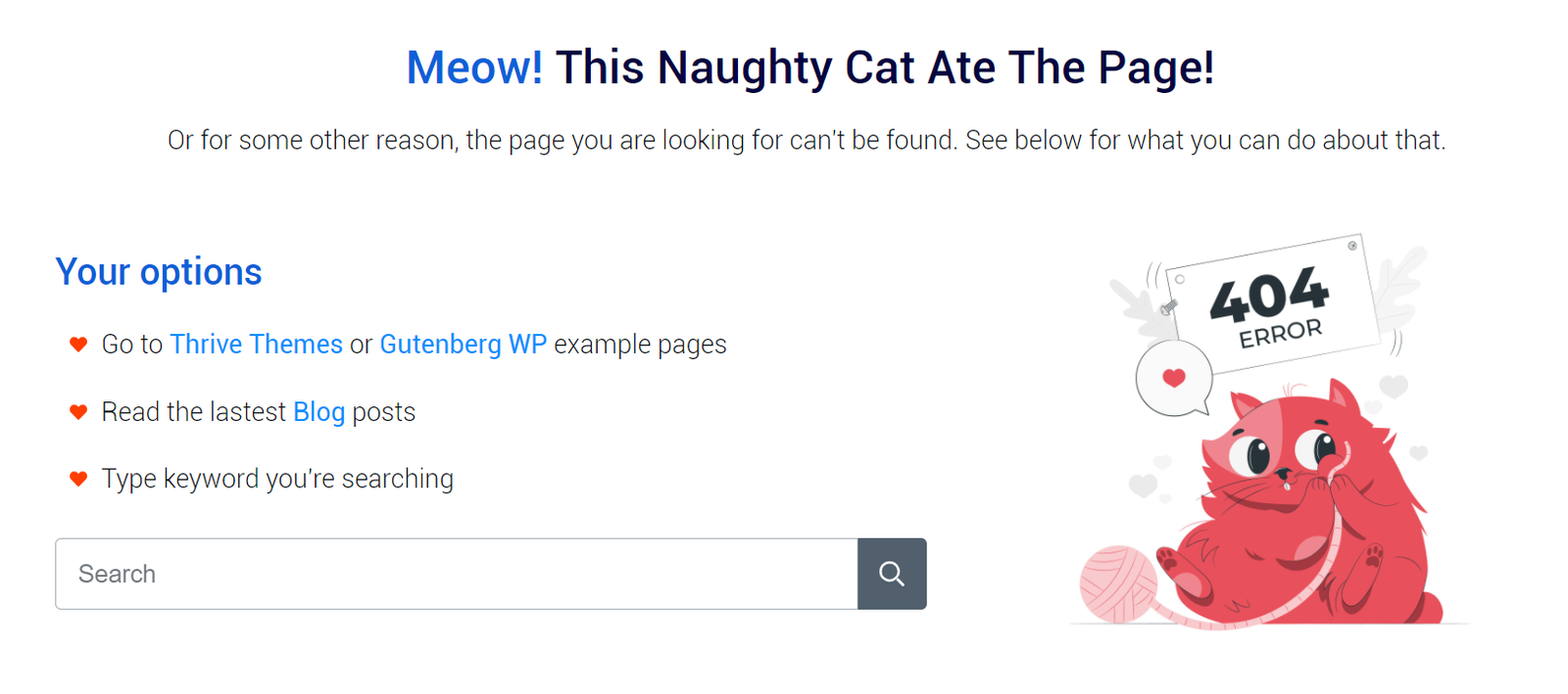
You Don’t Marketing with 404 Pages
404 pages are silent traffic killer. When it happens, most visitors simply hit the back button and leaving your site for good. And most website owners don’t even try to look at the positive side of these pages. But we want to keep visitors stay longer!
How to fix

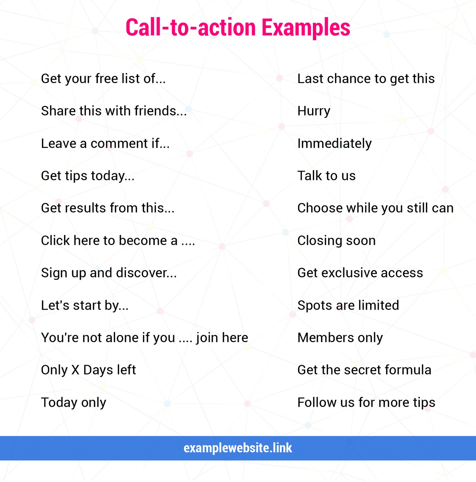
Your Website Doesn’t Have A Clear Call - To - Action
Another common mistake people make on their website is not asking for what you want. For each page of your site, ask yourself a simple question: What do I want my visitors to do? Something I’ve learned in life is that you won’t get what you want unless you ask for it, and be clear with your intention. You need to be your own website’s captain. Drive visitors to exactly where you want them to go. There should be no dead ends. No wondering what to do next.
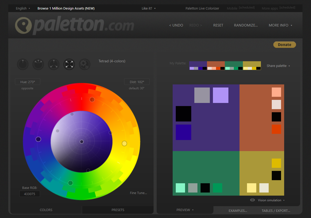
Ah, and don’t forget to choose the effective colors and words for your calls to action (or “CTAs”). We don’t only want a good-looking CTA button but also a button that can gain more clicks.
PRO Tips:


Conclusion
This is not a complete list, but it’s a great starting point if you’re looking to create a profitable site. By keeping things clear, pithy, conclusive, and calling visitors to action, you will engage your website’s users - which will increase the possibility that they will convert to clients.
I hope that this post is useful for you and has helped you identify your website’s problems and then make changes to benefit your business.
If you still have question or need help with re-design your website, please contact me here.
- How To Buy A Baby Stroller - March 24, 2021
- 5 Common Mistakes You’re Making on Your Website and How to Fix (plus PRO Tips) - November 10, 2020
- 3 Best WordPress Plugins to Create Responsive Comparison Tables for Affiliate Site - November 10, 2020


 Line spacing determines the amount of vertical space between lines of text in a paragraph.
